Include popular icons in your React projects easily with react-icons, which utilizes ES6 imports that allows you to include only the icons that your project is using.
A react-icons fork, for credits and fork motivation read here.
Go to icons.meronex.com
- Just add react component and modify the size, color, style, etc
- Includes the most popular open source SVG icon sets
- Import each icon independently preventing blowing up the bundle size
- Fast search for all icons
yarn add @meronex/iconsnpm install @meronex/icons --saveimport FaBeer from '@meronex/icons/FaBeer';
class Question extends React.Component {
render() {
return <h3> Lets go for a <FaBeer />? </h3>
}
}View the documentation for further usage examples and how to use icons from other packages. NOTE: each Icon package has it's own subfolder under @meronex/icons you import from.
For example, to use an icon from Material Design, your import would be: import ICON_NAME from '@meronex/icons/md/ICON_NAME';
| Icon Library | License | Version |
|---|---|---|
| Font Awesome | CC BY 4.0 License | 5.12.1 |
| Ionicons | MIT | 4.5.6 |
| Material Design icons | Apache License Version 2.0 | 3.0.1 |
| Material Design Community icons | SIL | 52442e9e6ea4424c41fb6489911c6f87fe83a7a8 |
| Typicons | CC BY-SA 3.0 | 2.0.9 |
| Github Octicons icons | MIT | 8.5.0 |
| Feather | MIT | 4.21.0 |
| Game Icons | CC BY 3.0 | a53463d41d4f055fa71097ae74da4c508c9bb09d |
| Weather Icons | SIL OFL 1.1 | 2.0.10 |
| Devicons | MIT | 1.8.0 |
| Ant Design Icons | MIT | 4.0.0 |
| Bootstrap Icons | MIT | 1.0.0-alpha3 |
| Remix Icon | Apache License Version 2.0 | 2.3.0 |
| Flat Color Icons | MIT | 1.0.2 |
| Grommet-Icons | Apache License Version 2.0 | 4.4.0 |
| css.gg | MIT | 2.0.0 |
| IcoMoon Free | CC BY 4.0 License | 1.0.0 |
| BoxIcons | CC BY 4.0 License | 2.0.5 |
| VS Code Icons | CC BY 4.0 | 0.0.1 |
| flag-icon-css | MIT License | 3.5.0 |
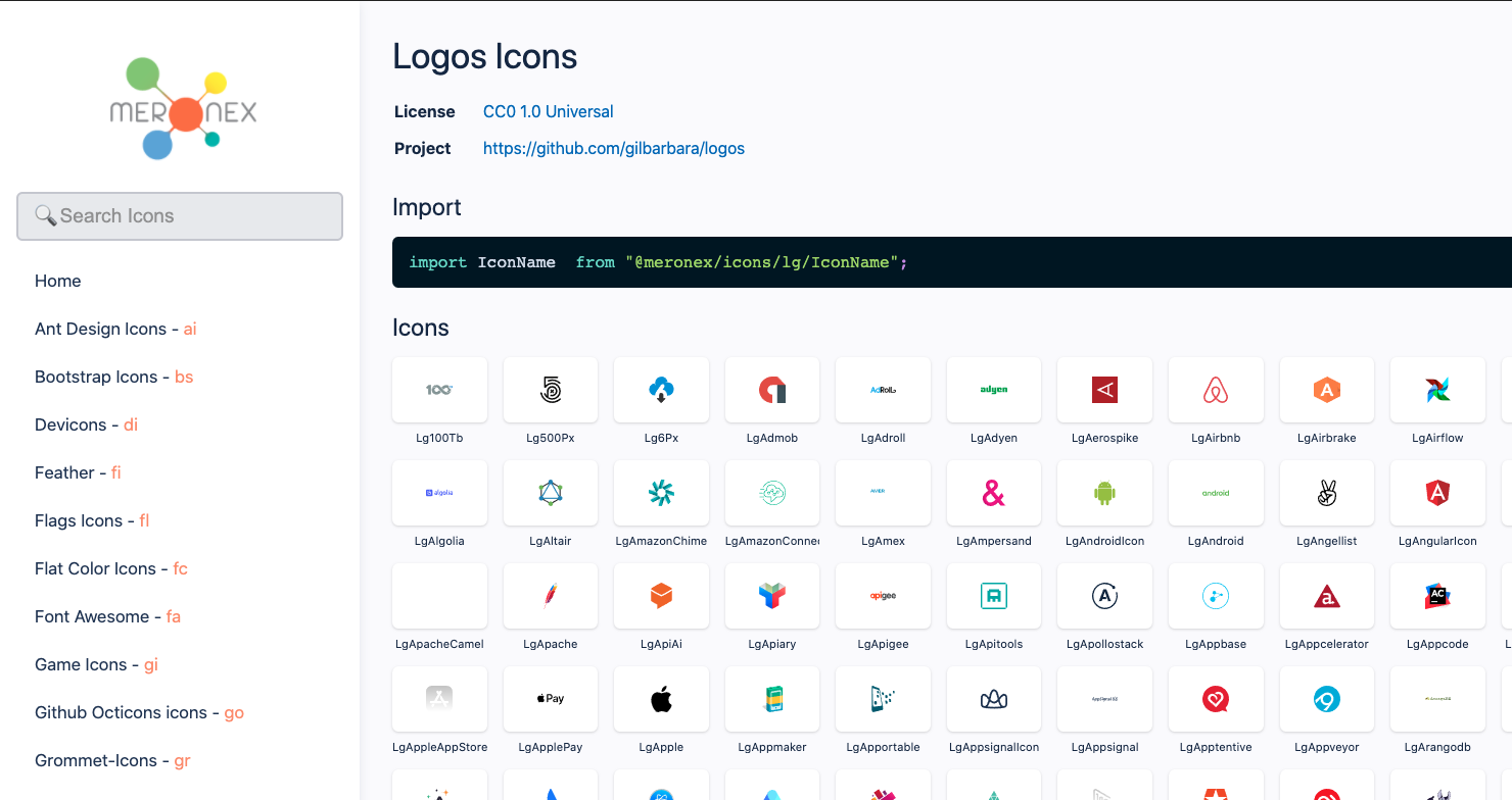
| Logos | CC0 1.0 Universal | 2018.01 |
| Simple Icons | CC0 1.0 Universal | 1.17.1-998-gd4b07ad4 |
| Heroicons | MIT | v0.3.7 |
| Twemoji | MIT | v13.01 |
You can configure react-icons props using React Context API.
Requires React 16.3 or higher.
import { IconContext } from "@meronex/icons";

<IconContext.Provider value={{ color: "blue", className: "global-class-name" }}>
  <div>
    <FaFolder />
  </div>
</IconContext.Provider>| Key | Default | Notes |
|---|---|---|
color |
undefined (inherit) |
|
size |
1em |
|
className |
undefined |
|
style |
undefined |
Can overwrite size and color |
attr |
undefined |
Overwritten by other attributes |
title |
undefined |
Icon description for accessibility |
From version 3, vertical-align: middle is not automatically given. Please use IconContext to specify className or specify an inline style.
<IconContext.Provider value={{ style: { verticalAlign: 'middle' } }}>Component
<IconContext.Provider value={{ className: 'react-icons' }}>CSS
.react-icons {
  vertical-align: middle;
}Dependencies on @types/@meronex/icons can be deleted.
yarn remove @types/@meronex/iconsnpm remove @types/@meronex/iconsyarn
yarn submodule # fetch icon sources
cd packages/react-icons
yarn buildThis project uses Conventional Commits format for the commit messages.
    "build",
    "chore",
    "ci",
    "docs",
    "feat",
    "fix",
    "improve",
    "perf",
    "refactor",
    "revert",
    "style",
    "test",
The preview site is the meronex-icons website, built in NextJS.
cd packages/react-icons
yarn build

cd ../preview
yarn startThe demo is a Create React App boilerplate with react-icons added as a dependency for easy testing.
cd packages/react-icons
yarn build

cd ../demo
yarn startFrom the main directory (where this file is located) run the following command:
cd packages/react-icons	git submodule add --name <name> <git-repo-url-for-the-new-icon-set> packages/react-icons/src/icons/<name>
yarn build yarn start
Add the name, URL, and the license link to the table in the ##Icons section of this file.
Keep the list in alphabetical order.
Add the object with the following structure:
{
      id: "xy",                                    // Two-letter id
      name: "e.g. Xenon Yellow Icons",             // The full icon set name
      contents: [
        {
          files: path.resolve(__dirname, "<relative-path-to-git-submodule>/<path-to-svg-icons>/<filter>"),
          formatter: name => `Xy${name}`            // So that all icon names from this set will start with "Xy"
        }
      ],
      // URL of the github repo
      projectUrl: "https://github.com/xy/xy-icons",
      license: "Apache License Version 2.0",        // License type
      licenseUrl: "http://www.apache.org/licenses/" // URL of the license definition
}
to the icons array.
SVG is supported by all major browsers. With react-icons, you can serve only the needed icons instead of one big font file to the users, helping you to recognize which icons are used in your project.
This is a fork of react-icons and was created specifically to resolve the bundling size issue #154, see here.
It was meant to be used temporary until the fix PR merged upstream however due to the lack of activity at the react-icons repo, I have decided to put publish it as it could perhaps save others the patching time and effort I had to go through.
As I said that was initially meant for internal consumption, the bundle issue was a show stopper for us, I've submitted a PR which is not merged yet and this issue has been open for two plus years. I don't have time/desire to redo the preview site, so I just shared what I have.
Feel free to fork edit and host else where if you need to as I did.
I've merged some open pull requests, added icons and fixed some performance issue with the preview site, more specifically:
-
Added Icon Sets
- flag-icon-css
- IcoMoon Free
- Simple Icons
- Logos
- VS Code Icons
- Remix Icons fill
- Heroicons
- BoxIcons
-
Merged open PRs
-
Improved the preview site
- Show the icon set next to the titles
- Improve search performance by caching results
- Copy the entire absolute URL so it can be easily inserted
I'd rather have the changes merged upstream I don't prefer fragmented react community, however I plan to keep this maintained until react-icons regains momentum. My view on this that if you publish open source, then you've to be responsible for the longevity of it when others depend on it and willing to offer a hand, otherwise don't publish at all.
- forked from react-icons
- react-svg-morph
MIT
- Icons are taken from the other projects so please check each project licences accordingly.